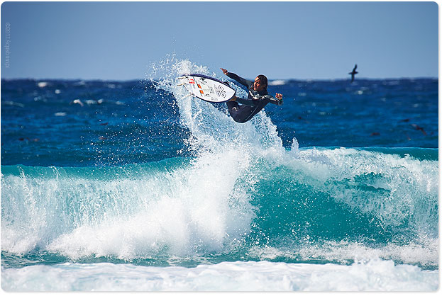
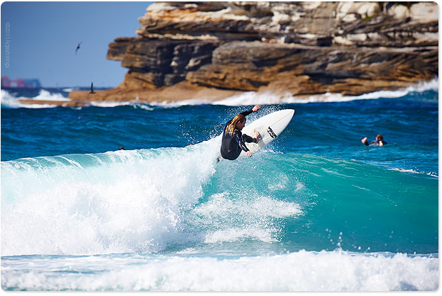
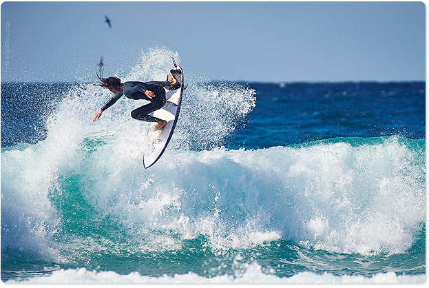
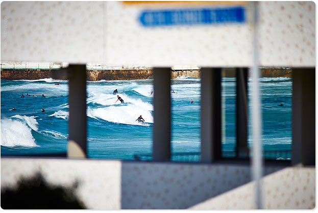
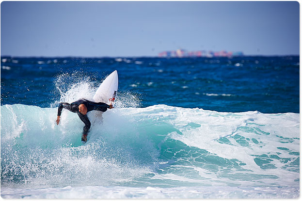
All beaches have a specialised set of ingredients that the make for good surfing. For Bondi, for me, it’s a slight onshore day, sunshine and south swell with 3-4 footers. Just like today. There’s a little left rip bowl at second ramp that looks like fun. I reckon the onshores give it a little push and makes it a bit ‘lippy’.
It is a lot cooler today. 21.
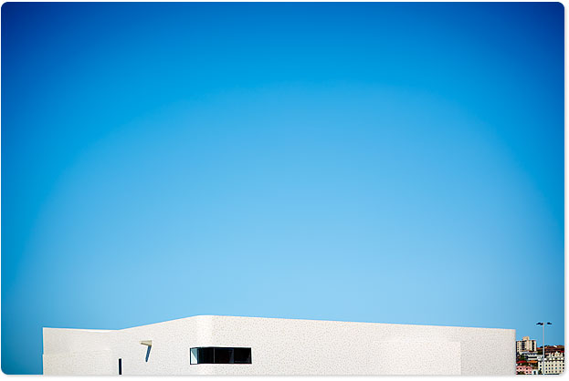
What do you guys think of the new North Bondi SLSC? Comment
Hey don’t forget the Aquabumps Gallery is open all weekend, like it has been for 9 years, 10am to 6pm 151 Curlewis Street Bondi beach Telephone 9130 7788. Our new gallery is pretty slick…you’ll see when you get down here.
B y e : : u g e










I have only looked at it while sitting out the back at south Bondi
I half like it however I think the window areas are dispropotionate in height to the size of the building which makes it appear too much like a fortress.I have not been in the internal space .
The only thing that is missing are sand bags and a few rifles and machine guns protruding from the windows.
I am aware that the Howard Goverment cut their funding by half but it would not have cost al lot more for the extra glass .
Sean’s Panaroma. Pan – Aroma.
The Club is fine, just waiting for them to remove the portables and the junk. Check the size of the walk in skip they dumped on the last remain grass/dirt!
My grandfather (r.i.p) was a surf life saver back in the 1920s or 1930s at North Bondi Surf Club.
He’d like the new club. He was born in 1912 and always used to tell me how there was a horrendous storm the day he was born and that the big rock out Ben Buckler point was washed up that day…. http://www.waverley.nsw.gov.au/__data/assets/pdf_file/0004/37480/The_Big_Rock.pdf
looks pretty big to be just washed up. Bondi was a very different place back then he use to say, people rode horses around, no promenade, no units….
New NBSLC – unreal. At last we have a serious piece of public architecture in Bondi. Make no mistake, this is a challenging building but ultimately it is the challenging buildings which have the greatest resonance and stand the test of time. For the most part Bondi is an architectural wasteland – can’t believe the bogan designs (both public and residential) that continue to get past council and have otherwise been blighting our suburb for decades. We have butchered our built environment. The ultimate test of this is what the place would be like if you took away the beach. It would be a tip. No one would come. Fact.
This new building is a thought provoking piece of sculpture. No angle is the same and there is always a new perspecitve (inside and out). As for the windows, they look perfect when you are inside and they each frame the beach views in a different and interesting way. This is not RSL “architecture” – you don’t need massive windows when the whole beach is just outside the front door.
An architecturally magnificent building designed by a serious firm of architects that is a gift to Bondi. Bravo North Bondi SLSC for the courage to take on such a challenging design. Taking one back for the asthetes. About time.
PS – I have no connection with NBSLSC or the architects.
I couldn’t agree more with Phil.
Both the Council and architects have a lot to answer for on the previous and current abominations that dot our beach side landscape.
Thumbs up for me!
Geez! Phil….. Calm down mate
Phil,
Do you like the new SLSC?
Somewhere between a marshmallow on steroids and a nicely tiled WW2 coastal bunker, the architectural brief continues the recent Eastern Suburbs real estate push to maximise your boot print. Saw some locals jammed against the walls on the warm weekend because there is no shaded awning or collonade, no liminal place between beach and building, you are either inside or outside. Did see some volunteers working on the doors to the cramped storeroom under the promenade where the actual life saving IRBs and boards are kept. Not the whole doors, just screwed some plywood sheets over the old frames – guess the money got soaked up in gym equipment and setting up the bar. And by the way, where’s the clock?
Sent the photos featured in deBrito’s blog to an architect friend in SIngapore , this was his response! D Elf
Looks interesting – it is an surprising typology to use for that location. You would expect a building that has a very clear directionality – a clear front facade facing the beach and a back facade facing the road. Whereas this design seems like it has no real front – the facade facing the beach is not that open, and the staircase might even make it seem like the back. I am not sure what the street facade looks like – the images don’t show that view.
But I am not saying that it is a bad thing – just unexpected. It is a more complex kind of approach…
As usual great photos, but I have to say that I loved the videos. New Zealand, Along the road.
Great work.
It is another example of crap modern architecture.
Doesn’t utilise the location at all with windows and bunker style. Must have been built on a tight budget and was probably deigned by someone in primary school.
It will last for ever but is a shining example of how Australia is clueless on modern architecture.
Someone had to tell the truth.
wasn’t the architecture detrimentally affecting things down at the beach this morning.. it was the pro-clubbie on his little speaker thing harrassing the fellas straying too far past the ‘no surfcraft’ sign. dude was at it forever. if it’s that important just peel yourself out of your quad bike, get on your paddle board and go out and tell em, mate.
or, here’s a thought, avoid the neat little left and move your flags a smidge to the north. plenty of safe water there.
tomorrow, we’ll have the jet ski and irb’s trawling up and down the beach filling the air with noise and 2-stroke fumes.
also, Uge, great pics as per usual, thanks.
Hours of fun.. simply love it. Beau-ti-ful piece of life that you captured there
Uge, having surfed the beaches from Maroubra to Bondi for over 30 years -every condition- your comments on the south swell at 4ft and slight onshore are so true – we all love it smooth but as you say it does give it a bit more lip. Love it and live for some of the big, woolly onshore days. Fresh air and plenty of room to move.